01 / FIND, CHANGE, VERIFY
Three defects. Three observable fixes.
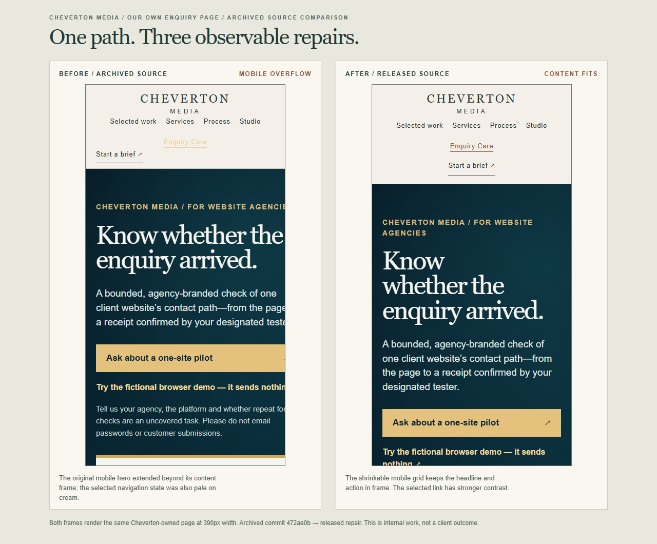
Mobile copy stayed inside the frame
At a 390px review width, the two-column hero’s minimum sizing pushed the headline, copy and pilot action outside the available content area. We changed the mobile grid to a shrinkable single column and allowed its children to contract.
After release: a 375px interior viewport measured 375px of document scroll width; the 335px hero grid and pilot action fit.
The active link became readable
The selected “Enquiry Care” navigation link was pale gold on the cream header. Its computed colors measured about 1.28:1 contrast. We changed that one active state to a dark brown while keeping an underline and visible keyboard focus.
After release: the new colors calculate to about 5.33:1 contrast for normal text.
The demo led somewhere useful
The fictional browser demo validated fields but offered no route back to the proposal or a pilot enquiry. We added two visible links by the result state: “Ask about a pilot” and “Back to the offer.”
After release: both links were exposed to the browser accessibility tree; empty-field validation still displayed its error summary.